- 05th Nov '25
- KYC Widget
- 5 minutes read
 SHARE
SHARE SHARE
SHARE SHARE
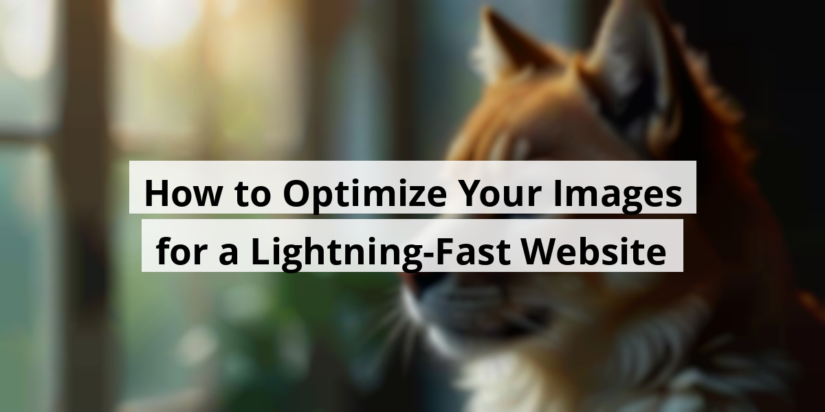
SHAREHow to Optimize Your Images for a Lightning-Fast Website
Let’s chat about images on websites. Remember those times you clicked on a page only to be greeted with a picture big enough to make your internet connection scream in agony? Yeah, that’s a no-go. Optimizing images isn’t just tech lingo; it’s more like giving your website a much-needed spa day. It’s all about making things pretty while keeping the speed intact. So, whether you’re a seasoned pro or just dipping your toes into web design, we've got some down-to-earth tips that’ll have your site looking like a million bucks without the hefty price tag. Grab your favorite snack and let’s get into some tried-and-true ways to make your visuals pop on every screen!Key Takeaways
- Image optimization boosts load times, improving user experience.
- Different formats suit different purposes; choose wisely!
- Responsive images are key—adapt them for all devices.
- Quality isn’t sacrificed with proper compression techniques.
- Consistent dimensions keep your site looking tidy and professional.
Now we are going to talk about a crucial aspect of website management that often flies under the radar—getting our images to play nice with our sites. So, let’s jump in!
Understanding Image Optimization for Websites
We’ve all been there, surfing through a website only to be greeted by a snappy loading time of... well, not so snappy. It reminds us of waiting for a kettle to boil while staring at a *huge* chocolate cake—excruciating! That's where image optimization struts onto the scene, wearing a superhero cape. Basically, we want our images to be just the right size and type, like finding that perfect Avocado in a grocery store—spot on!
Why Does Image Optimization Matter?
When we think of our site's health, imagine it’s like our own diets—some indulging and others lean and mean! Good website performance is the salad of the internet; we need it for a balanced diet of user engagement and search engine favor. Seriously, optimizing images can boost SEO, reduce bounce rates, and—here’s the kicker—save valuable space.
So, next time we upload photos like we’re hosting a family BBQ, consider this: losslessly compressing our images can make them shrink by up to 75%! Yes, that means our beloved high-resolution pics can start behaving like well-mannered guests—enhancing speed but not losing their charm.
- Improved page load speeds mean happier visitors!
- Better SEO performance gets us closer to ranking glory.
- Less storage space is like saving for a rainy day—just smarter!
Take it from experience; nobody wants to sit through a buffering bar with a face full of anticipation. Sites that load sluggishly might cause potential customers to click away faster than a sneeze in a crowded room. Who knew that a couple of clicks could lead to picking up takeout instead?
It’s all about optimizing content; we want images that compliment our text—not clash like an uncoordinated fashion ensemble! With the right strategies in place—like choosing the correct image formats or keeping file sizes down—our sites will thank us later.
We can apply techniques such as selecting JPEG for photographs and PNG for graphics with transparent backgrounds. It’s like knowing when to wear sneakers versus dress shoes. A little planning goes a long way—our websites might just end up looking as sharp as an arrow in the bullseye!
Let’s keep our websites efficient, friendly, and above all, speedy. After all, in the vast sea of the internet, who wants to be a ship stuck in the harbor of bad image loading? Time to optimize and let our sites sail smoothly into the sunset!
Now we're going to talk about different image formats we often come across in web design and when it's best to use each of them—kind of like sorting through your sock drawer, but more colorful!
Popular Image Formats and Their Ideal Uses
Familiarity with various image formats can make a world of difference in how our websites look and feel. Let’s break down some of the most common formats that are still making waves today.
- SVG (Scalable Vector Graphics)
- PNG (Portable Network Graphics)
- JPG (Joint Photographic Experts Group)
- GIF (Graphics Interchange Format)
SVG
Best For: Logos, icons, charts, and sometimes, even a simple dance move.
Bad For: Detailed photos or anything wanting to show off its three-dimensional charm.
SVG files are fantastic buddies because they can stretch and squish without losing any sparkle. They’re the favorite choice for logos or icons on our phones, whether we’re at a coffee shop or on a crowded subway. And let’s be honest, who doesn’t love an image that can easily adapt? Talk about versatility!
PNG
Best For: Images with see-through backgrounds, like those stylish ghost logos.
Bad For: Heavy-duty images that need a dynamic resize (like your favorite pair of jeans that somehow shrank in the wash).
Portable Network Graphics are like the fancy cousins of images. They come to the party with transparency and are great for making logos pop. Ever tried using a PNG for a YouTube thumbnail? Goldmine! Just remember, use them wisely; they can get hefty in size faster than your last grocery bill.
JPG
Best For: Family vacation photos and food pictures that scream, "LOOK AT THIS DELICIOUSNESS!"
Bad For: Fancy graphics or logos that need to look sharp.
GIF
Best For: Those silly animations, reactions, and line art that makes you chuckle.
Bad For: High-quality photos or color-saturated masterpieces.
Ahh, good old GIFs—sometimes goofy and always fun! They’re like the animated sidekick in a buddy cop movie, bringing energy to our online conversations. With tons of free tools popping up, whipping up a GIF is like baking a cake, and who doesn’t want to slice into a delicious animated treat?
The best part is that knowing the right format can save us from a huge headache down the line! So let’s keep our digital spaces vibrant while keeping an eye on those pesky loading times, shall we?
Now we are going to talk about making images fit like a glove across various screens. Every image should look like a superstar, whether it's on a tiny phone or a massive 4K monitor, right? Let's unpack this together.
Adapting Images for All Screens
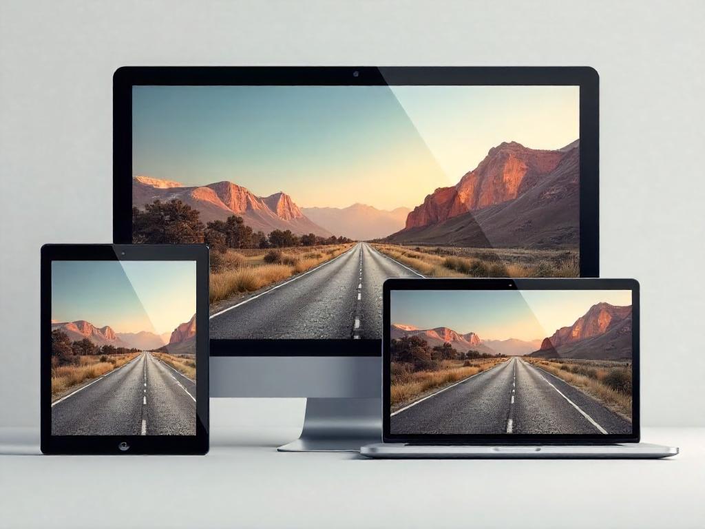
We’ve all been there: scrolling through our phones while waiting for our coffee and suddenly, there it is—a stunning image that just looks... off. On a small screen, that perfectly framed picture from a DSLR appears pixelated. What do we do then? Well, we rely on the magic of multi-version images. Sounds fancy, doesn’t it?
This is where the srcset attribute comes strutting in. It's like the personal stylist for our images—choosing what fits best depending on the device in use. Back in the day, we might’ve thought of just resizing files until our screens shined like a new penny. But alas, technology takes us farther than our parents’ slideshows!
Not too long ago, I tried to upload a vacation snap from a trip abroad. I had two versions of the same image: one suited for Instagram’s squares and another that could grace my desktop as wallpaper. It felt like I was juggling flaming batons! But thanks to srcset, it took the pressure off. Think of it as giving each image its chance to shine. We can’t have our pictures playing hide and seek! So let’s list how we can make responsive images work for us:
- Choose appropriate image sizes for different devices.
- Utilize the srcset attribute wisely.
- Test how images look on various screens.
- Keep an eye on loading times for faster experiences.
| Device Type | Image Size | Resolution |
|---|---|---|
| Mobile | 640px | 1x |
| Tablet | 1280px | 2x |
| Desktop | 1920px | 3x |
Using responsive images today ensures everyone gets to enjoy crystal-clear vacation photos—no squinting required! And, with the rise of shorter attention spans, having images that load quickly and look great could be the difference between a viewer sticking around or clicking off to their cat video. Don’t make our images sad! Let’s give them some love with proper sizing! What are your thoughts on optimizing image presentations? We'd love to hear how you tackle the image game!
Now we are going to talk about how to choose the right images for your website and make them shine without dragging it down like a lead balloon.
Choosing the Right Image Dimensions and Quality
Let’s face it, no one wants to visit a site that looks like it’s stuck in the ’90s. When picking images, we need to consider both their dimensions and quality. It’s usually a safe bet to upload images at the size that’ll be displayed on a widescreen monitor. Remember that moment when you clicked on a thumbnail only to end up squinting at a blurry mess? Yeah, we don’t want to do that to our guests. If you're using WordPress, it's like having a helpful assistant who automatically makes those images smaller for mobile devices. Just imagine that assistant taking a nap when you’re coding manually—it can get a bit tricky. Here’s a quick recipe for success when it comes to images:- Optimize File Size: Aim for images that are under 1MB, unless you want to test your audience’s patience.
- Select Formats Wisely: JPEG and PNG are your go-to superheroes. SVG? It's the caped crusader for logos and vectors!
- Use Responsive Images: If you're in the wild west of hand-coding, familiarize yourself with CSS. It’s like learning to ride a horse instead of relying on a car.
Now we are going to talk about a topic that's crucial for anyone who runs a website. It's a matter of pixels and pixels of fun, really. We're diving into something that many often overlook but can save them a world of headaches down the line: image compression.
What Exactly is Image Compression?
So, here’s the deal. Image compression is all about shrinking down those hefty files that can make your website slower than a slug on a sticky note. When we manage to slim down an image's size without turning it into a pixelated blob, we’re practicing what’s known as lossless compression. This nifty trick is like throwing a pair of jeans in the dryer on a hot cycle: you want them to fit without looking like a potato sack, right? So why bother? Well, faster loading times not only keep visitors from throwing their devices against the wall in frustration but they also improve your site’s search engine rankings. And nobody likes being stuck on page two of Google, right? Here's a little list to chew on about the perks of image compression:
- Improved loading speed: because who has time to wait?
- Enhanced visitor experience: keep them engaged, and they’ll stick around.
- Better SEO: because every click counts!
Now, think about last week’s lunch. You had that giant sandwich, right? Taking a few bites out of it made it easier to handle; the same principle applies to our images. A prime example is those trendy food blogs everyone seems to love. You know the ones! They’ve got drool-worthy photos that seem to load in the blink of an eye. How do they do that? By compressing their images! It’s the industrial diet plan for your pictures; they get to strut their stuff without dragging any extra baggage. It’s all about making those files sleeker while keeping the tasty visuals intact.
We’ve all experienced those frustrating moments when a site takes what feels like an eternity to load, practically giving us time to brew a cup of coffee. Image-heavy pages can fatten up like a Thanksgiving turkey, and before you know it, you’re glued to the screen watching the loading spinner dance. No thanks! That’s where compressing comes in. It’s like trimming down those Thanksgiving leftovers into a nice, tidy sandwich for the next day—making it easier to digest. Taking a moment to compress images before uploading can save you from tech-induced frustration down the road.
In summary, image compression isn’t just a fancy term; it’s a vital step in making sure our websites run smoothly, our visitors are happy, and we rank high in search results. So let’s get to it, and let those images shine—without all the weight!
Now we are going to talk about how we can make images smaller and more efficient without losing that professional touch. Who knew image compression could be the unsung hero of website performance? Let’s share some handy tools to help us on our quest for faster loading times.
Effortless Image Compression Techniques
LiteSpeed Cache
First up, we've got LiteSpeed Cache. It’s like that friend who always brings snacks to the party but also gets the party started. This plugin pairs beautifully with the LiteSpeed web server, turbocharging your site’s speed while giving your images a nice diet plan! So, don’t leave your images hanging—check out how to integrate it seamlessly.
cPanel Images Tool
Shockingly, some users overlook the handy image tools hiding in their cPanel hosting. The cPanel images tool is a treasure chest for managing images. Here’s what you can dig up:
- The Thumbnailer: Your go-to for mini-me images.
- The Scaler: For flexing those pixels—enlarge or shrink images as needed.
- The Converter: Ever wanted to swap between file types? This tool’s got your back!
The thumbnailer gives you smaller versions of multiple images, while the scaler adjusts single images. The converter? It’s like a passport for your images, allowing them to jump from one file type to another. Check out the cPanel tutorial for the nitty-gritty.
Gzip and Mod_Deflate Modules
If we’re squeezing images, why not compress files too? Enter Gzip and mod_deflate. Available on all WHC servers, these modules can shrink file sizes and improve your website’s performance significantly. Imagine saving up to 81% on bandwidth—enough to make even your internet service provider smile.
Other WordPress Plugins
Besides LiteSpeed Cache, let’s not forget about the other noteworthy plugins for our image-crunching needs.
For a taste of freemium goodness, ShortPixel offers image optimization for a handful of files for free. Just install and grab the API key. Not up for the hassle? Smush is ready to jump in without the key drama, helping slow-loading sites feel light again.
Other Online Tools
For those who love the thrill of the free-for-all online tool buffet, let's highlight three favorites.
TinyPNG / TinyJPG
Check out TinyPNG. This stellar website allows you to upload 20 images daily and reduce file size by up to 70%, all while keeping quality intact. It’s the superhero we didn’t know we needed!
ImageRecycle
For those sticky GIFs or PDFs, ImageRecycle has got our back. A free trial is available, perfect for smaller projects, but beware if you have a mountain of images—premium plans are a good deal when you have lots to crunch.
Optimizilla
Last but not least, say hello to Optimizilla. It works similarly to TinyPNG and can compress up to 20 images at once. A little experiment with an image turned out fabulously—down by a staggering 80%! Who knew compression could feel so good?
Next, we’re going to talk about how to maximize your images for a polished online experience while keeping the tech gremlins at bay. It’s a bit like choosing the right outfit for an occasion – you wouldn’t show up to a wedding in sweatpants, right? Let’s get into the nitty-gritty.
Optimizing Images for Your Website's Needs
When uploading images, think size matters. For instance, we once had a client who posted a stunning 10MB photo for their blog. Let’s just say, even my grandma’s dial-up connection might have thrown in the towel! Using the smallest dimensions that still look fabulous is key. If it’s a full-screen background, a whopping 1920x1080 is appropriate. But for profile pics or testimonials? Oh, you can definitely downsize!
Here’s a quick rundown of image dimension strategies:
- A full screen image: 1920x1080 pixels
- A banner image: 1200x600 pixels
- A profile image: 400x400 pixels
- A thumbnail: 150x150 pixels
Beyond just size, let’s talk formats because honestly, it’s not just what’s on the outside that counts! You’ve got your SVGs (perfect for logos or graphics), PNGs (great for images with transparency), JPGs (ideal for photos), and of course, good old GIFs (who doesn’t love a fun dance meme?).
Each one has its charm, but remember—sticking to the right format can save you from some classic blunders. Imagine trying to use a GIF for a high-quality photo. It’s like trying to cook a steak on a grill meant for hot dogs – just doesn’t work!
| Image Format | Best Uses | Pros | Cons |
|---|---|---|---|
| SVG | Logos, graphics | Scalable without losing quality | Browser compatibility issues |
| PNG | Images with transparency | High-quality images | Large file sizes |
| JPG | Photography, landscapes | Small file sizes | No transparency |
| GIF | Simple animations | Easy to share | Limited colors |
By keeping these tips in mind and applying a little testing, we can make sure our images load quickly and look fabulous. And let’s be honest, there’s nothing worse than a slow-loading website – it’s like watching paint dry, and no one wants that! So get out there and optimize those images like a pro!
Conclusion
In wrapping up, optimizing images is like finding the perfect pair of shoes—great fit, good looks, and comfortable. It doesn't have to be a hard task. With a little know-how about formats, compression, and adapting sizes, you can ensure your site not only looks beautiful but also performs like a champion. Remember, all it takes is a few clever tweaks to keep your visitors happy and engaged, not waiting around for heavy images to load. So go ahead, give those images a little TLC and watch your website shine!FAQ
- What is image optimization?
Image optimization involves resizing and compressing images to enhance website loading speed without losing quality, similar to finding the right avocado in a grocery store. - Why does image optimization matter for websites?
It improves website performance, boosts SEO, reduces bounce rates, and saves storage space, making for a better user experience. - What are some common image formats used in web design?
The most common image formats include SVG, PNG, JPG, and GIF, each suitable for different types of images and applications. - What is the best use for SVG files?
SVG files are best for logos, icons, and graphics that require scalability without losing quality. - When should you use JPG images?
JPG images are ideal for photographs and images that don't require transparency, as they offer good compression without sacrificing too much quality. - What is responsive image design?
Responsive image design ensures that images are appropriately sized and optimized for various devices, using the srcset attribute to serve the best image for different screen sizes. - What is image compression?
Image compression is the process of reducing the file size of images to enable faster loading times on websites while maintaining visual quality. - What tools can be used for image compression?
Tools like LiteSpeed Cache, cPanel Images Tool, Gzip, and various online tools such as TinyPNG and ImageRecycle can help compress and manage images efficiently. - What should the file size of images be for optimal performance?
Images should generally be under 1MB for optimal performance, helping to prevent long loading times that frustrate users. - How can image dimensions affect website experience?
Using appropriate image dimensions ensures that images appear clear and professional, preventing issues like pixelation across different devices.
 AI SEO Content Generation